[Introduction]
Translating abstract process automation into a clear, scalable brand system
IT consulting and automation are often difficult to communicate. The value is complex, abstract, and easy to misinterpret.
I designed Diergasia’s brand to turn process automation into something structured, visible, and easy to understand without losing technical credibility.


[Description]
Brand Challenge
Most IT consulting brands fall into two extremes:
Overly technical and difficult to approach
Generic and indistinguishable from other tech brands
For Diergasia, the challenge was sharper:
How do you visually represent “process” and “automation”?
How do you communicate authority without feeling cold?
How do you simplify complexity without oversimplifying the work?
The risk was building a brand that either confused clients or failed to stand out.
Context
Diergasia is positioned as a strategic partner for organizations looking to:
Improve internal workflows
Automate operations
Build scalable, structured systems
The brand needed to appeal to decision-makers while still reflecting technical depth.
Strategy
The key decision was to treat the brand itself as a system, not just a visual identity.
I built the identity around three ideas:
1. Make process visible
Instead of abstract symbolism, I used visual structures inspired by:
Flowcharts
System diagrams
Modular connections
This grounded the brand in something recognizable and meaningful.
2. Balance precision with approachability
Purely rigid systems feel cold.
To avoid this:
Sharp geometry was paired with subtle curves
Spacing and negative space were used to create clarity and breathing room
This allowed the brand to feel structured but not intimidating.
3. Reduce noise to increase clarity
Automation and consulting can quickly become visually cluttered.
I deliberately limited:
Color palette
Graphic elements
Visual variation
This reinforced the idea of clarity and control.
t
Solution
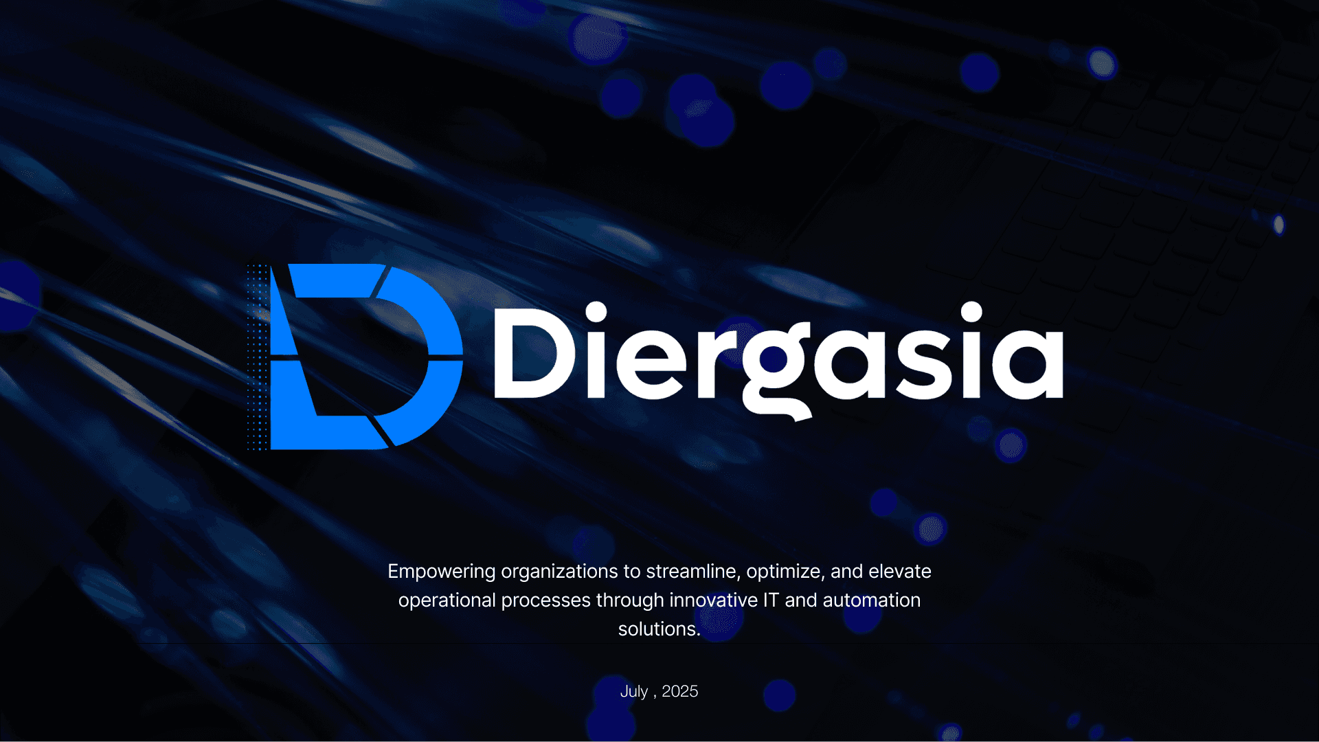
Logo System
A segmented “D” constructed from modular shapes.
Represents workflows and progression
Uses negative space to reinforce clarity
Balances sharp intersections with controlled curves
The mark functions as both a symbol and a system element.
Typography System
A geometric sans-serif typeface chosen for:
High legibility across contexts
A structured, technical tone
Consistency in digital and print use
Typography supports the idea of order and precision.
Color System
A restrained palette:
Black & white for structure and authority
Accent blue for trust and technological focus
The limited palette reduces distraction and strengthens recognition.
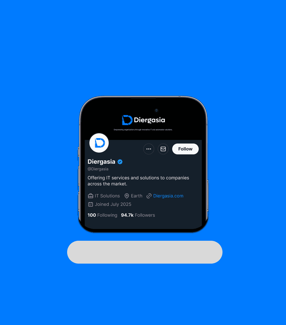
Graphic Language
Minimal, system-inspired elements:
Dot-based patterns
Subtle references to data flow and connectivity
These extend the identity without overwhelming it.
Outcome
The final identity positions Diergasia as:
Structured and methodical
Technically credible
Clear and approachable
It provides a scalable system that can extend across digital products, presentations, and consulting materials.
What This Demonstrates
Translating abstract ideas into visual systems
Brand strategy grounded in concept, not decoration
Designing for clarity in complex domains
Building scalable identity systems