[Introduction]
Design is rarely a straight line from idea to interface. In real-world teams, it’s messy, human, and shaped by constraints, conversations, and trade-offs. This article breaks down my practical design process—from uncovering the real problem to shipping with clarity and intent—focusing less on rigid frameworks and more on alignment, momentum, and outcomes. It’s how I move teams from uncertainty to execution, without losing sight of the people behind the product.

[Description]
My Design Process: From Problem to Product
A practical breakdown of how I approach design in real-world teams
Design is often presented as a clean, linear process.
In reality, it’s messy, human, and deeply contextual.
My design process isn’t about rigid steps or fancy frameworks — it’s about clarity, alignment, and momentum. Every project is different, but the principles remain consistent.
This is how I take ideas from uncertainty to execution.
1. Understanding the Problem (Before Touching Figma)
I don’t start with screens.
I start with questions.
Most design problems are not design problems — they’re clarity problems. Jumping into visuals too early usually leads to rework, misalignment, and wasted effort.
At this stage, my focus is to understand:
What problem are we actually solving?
Who is affected by it?
Why does it matter now?
What does success look like — realistically?
What constraints exist (time, tech, budget, trust)?
I listen more than I speak here.
Stakeholders don’t always articulate the real issue clearly, so I pay attention to:
patterns in complaints
repeated frustrations
emotional cues
inconsistencies in goals
Clarity at this stage saves weeks later.
2. Defining the Real Objective
Once I understand the problem, I translate it into a clear design objective.
Not vague statements like:
“Improve the experience”
“Make it more modern”
But focused outcomes like:
Reduce friction in onboarding
Increase user confidence at key decision points
Make complex information feel simple and trustworthy
Remove unnecessary cognitive load
This step is where alignment happens.
If the team can’t agree on what success looks like, the design will always feel “unfinished.” I make sure everyone is aligned before moving forward.
3. Research That Actually Informs Design
I don’t do research for decoration — I do it for direction.
Depending on the project, this could include:
reviewing existing product data
studying competitors and alternatives
analyzing user behavior and drop-off points
reading support tickets or complaints
quick usability checks
market and brand context
I’m not looking for volume — I’m looking for signals.
Patterns matter more than isolated opinions.
Behavior matters more than assumptions.
This is where empathy becomes practical, not theoretical.
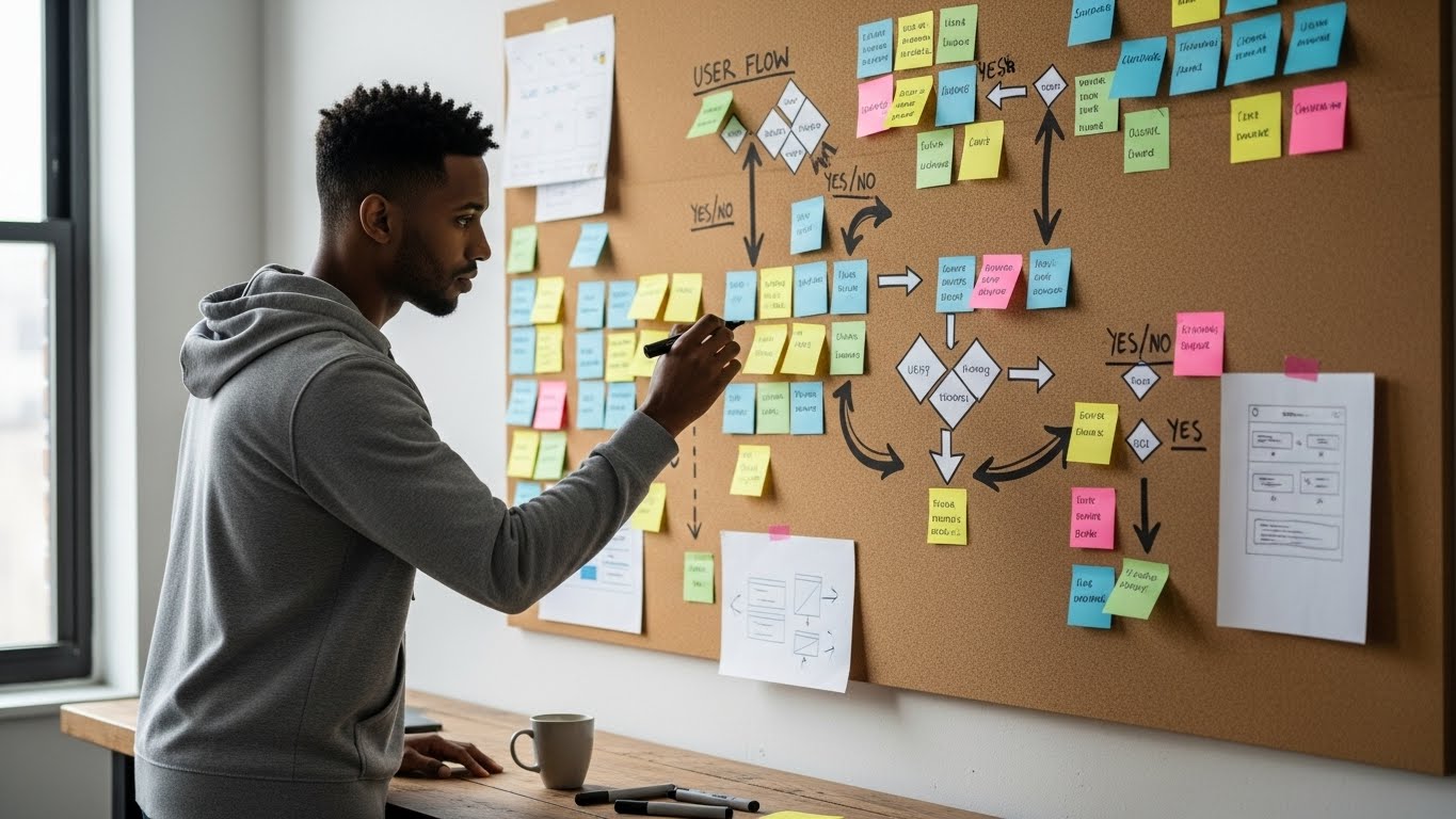
4. Structuring the Experience Before Designing It
Before visuals, I focus on structure.
I map:
user flows
key decision moments
entry and exit points
failure states
edge cases
This is where most design problems are solved quietly.
If the structure is clear:
layouts become obvious
UI decisions become simpler
consistency becomes natural
A well-structured experience reduces the need for explanation.
The product starts guiding users instead of instructing them.
5. Low-Fidelity Exploration (Thinking on the Canvas)
This is where ideas take shape — loosely.
I explore:
layout directions
hierarchy
content prioritization
interaction patterns
Low fidelity keeps things flexible.
It encourages feedback without attachment.
At this stage, I invite conversation:
“Does this flow make sense?”
“Is this moment clear?”
“What feels unnecessary here?”
The goal isn’t beauty — it’s direction.
6. Visual Design With Intent
When I move into high fidelity, every decision has a reason.
I design with:
hierarchy first
clarity over decoration
consistency across flows
accessibility and readability in mind
brand personality expressed subtly, not loudly
Colors, typography, spacing, and motion are not aesthetics for aesthetics’ sake — they’re tools for communication.
Good visual design doesn’t demand attention.
It earns trust.
7. Collaboration, Not Presentation
I don’t “defend” designs.
I walk people through them.
I explain:
the problem each decision solves
the trade-offs involved
the constraints considered
alternative directions explored
I welcome feedback — especially from engineering and product.
The best solutions often come from collaboration, not isolation.
Design improves when it’s discussed, not protected.
8. Testing, Refinement, and Reality Checks
Once designs are validated visually, I pressure-test them:
What happens if users rush?
What if they misunderstand?
What if they don’t read?
What breaks first?
This phase is about refinement:
simplifying flows
reducing steps
improving clarity
removing friction
Small changes here create massive improvements in usability.
9. Handoff With Context, Not Just Files
Design doesn’t end at handoff.
I ensure developers understand:
intent, not just layout
behavior, not just visuals
priorities, not just components
Good handoff prevents design decay.
Context preserves quality.
10. Reflection and Iteration
After launch (or implementation), I reflect:
What worked?
What didn’t?
What assumptions were wrong?
What patterns emerged?
This feedback feeds into my next project.
Design is cumulative.
Every project sharpens the next one.
Final Thoughts: My Process Is Human Before It’s Visual
My design process is built around:
clarity before creativity
empathy before execution
structure before polish
collaboration before control
Tools will change.
Trends will evolve.
But a human-centered, outcome-driven approach remains timeless.
Design, at its core, is not about screens —
it’s about people, decisions, and momentum.